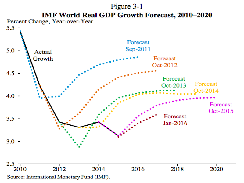
Since 2010, the International Monetary Fund’s outlook for global growth has disappointed.
And every year, the IMF cuts its global growth forecast only to have that lowered forecast eventually prove too aggressive.
For a brief period in 2011 and 2012, the IMF’s forecast for the global economy was a bit too bearish, but eventually the depressing trend was put back in place.
This chart, which comes from the Economic Report of the President, shows the sad state of global growth and perennially disappointed IMF forecasts.
And while the failure of these forecasts for one or two years out is notable, it might be most depressing to see the IMF’s 2011 forecast for 2016 gross-domestic-product growth of 5% miss the mark so widely. What could’ve been!
 White House