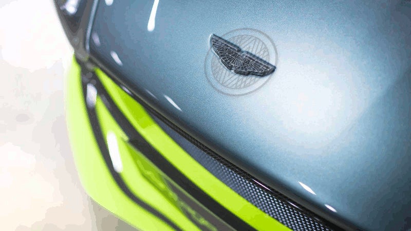
The world is quickly turning towards an era where nothing stands to survive traumatizing, unexpected change seemingly for the sake of change. For some damn reason, the Aston Martin logo design, the most inconic of which a winged beauty that has graced time unchallenged, is seemingly at risk.
Advertisement
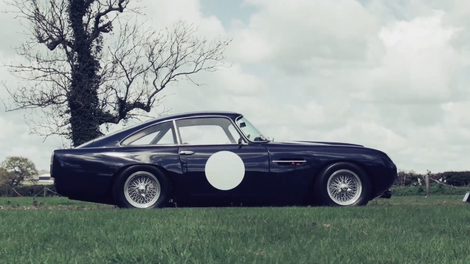
Sniffed out by AutoGuide, Aston Martin has been busy drawing lines in a circle and trademarking it as a new logo, much to my shock and horror. It looks like the cover of the 2012 Arctic Monkey’s album cropped over the iconic Volkswagen emblem. It’s circular, essentially featureless and completely unrecognizable as anything associated with the Aston Martin brand.
I hate it.
Advertisement
According to the filing, the new logo would be used for merchandise and branding lines, marketing and advertising, and “automobile chassis and design of land vehicles”.
Don’t you even think about it, Aston. Put this on any handbag, watch, titanium back-scratcher or kitchen applicane you wish, but it should never take the place of the bonnet wings.
AutoGuide asserts that if the logo does end up on a car, it may make its way into a Lexus-like grille design, or some absurd wheel pattern or something. As AG also points out, you can indeed faintly make out something resembling the 1921 design.
Sponsored
At the moment I can’t imagine any attractive application of this look on a car, whether its the grille, the seat, the wheels or the shift knob or whatever.
But we should be measured with our criticism, because if this just ends up being an etching at the base of a $2,000 thermos, I really wouldn’t care. Just don’t touch the wings.