
Instagram has a pretty recognizable design, but it could be due for a massive overhaul. Mashable reports that the Facebook-owned app is testing out a questionable new look on some of its users.
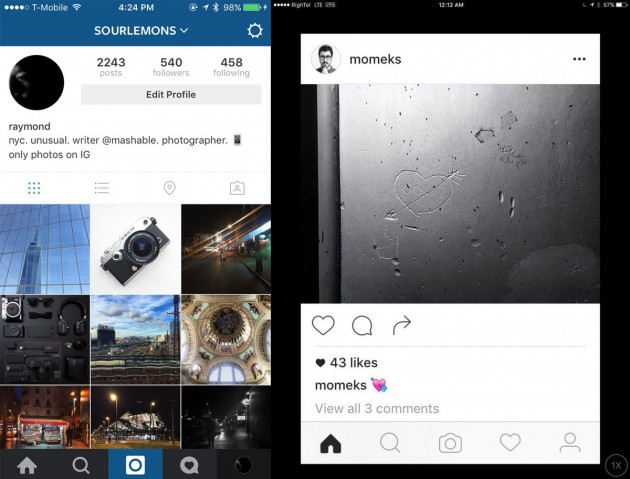
You can see the new version of the app above on the right, with the current official design on the left for comparison. The refreshed user interface is completely black and white, offering a simpler and duller feel overall. Individual icons have changed as well, with a flatter and more minimal design. For example, the notifications icon is now just a heart instead of a heart inside of a quotation bubble. The reason? It certainly seems to put a bigger emphasis on the photos and not the actual UI, which is kind of a neat visual trick.
This is just a test for now and only a small fraction of people are seeing the new design. Instagram tests new tweaks and features all the time, often pulling them entirely once they’re reported online. So this could easily be the end of Instagram’s new black and white design. Based on what we’ve seen so far that’s probably for the best.


