
Nissan finally pulled out of its torpor and did something exciting that didn’t involve smuggling a disgraced CEO in a suitcase: they finally showed a new Z car. If Nissan still has an iconic car in its stable, it has to be the Z, which has been around in various forms since 1969. The new Z Proto is clearly heavily inspired by the original Z, but also shows some other crucial design approaches that I think are important even without the retro inspirations. Let’s dig in a bit.

The original Datsun Fairlady Z — the goofily charming name they called it in Japan that would never, ever have a chance here in these Very Insecure States of America — was designed by a team headed up by Yoshihiko Matsuo.
Matsuo designed a sports car that fit very well in with the sportscars of the era, with dramatic long, long hood/short deck proportions and flowing curves. It had a low, strikingly sloping greenhouse that merged the rear hatch area into the roof in almost one seamless line, and had a face of an aquatic beast with an open rectangular grille and recessed headlamps, sometimes plexi-covered.
It felt like a Jaguar E-Type, just a bit more restrained and practical. It really was an almost unobtainable sportscar that almost anyone could actually obtain—affordable, reliable, usable, but with that look that made you feel funny in your squishy parts.

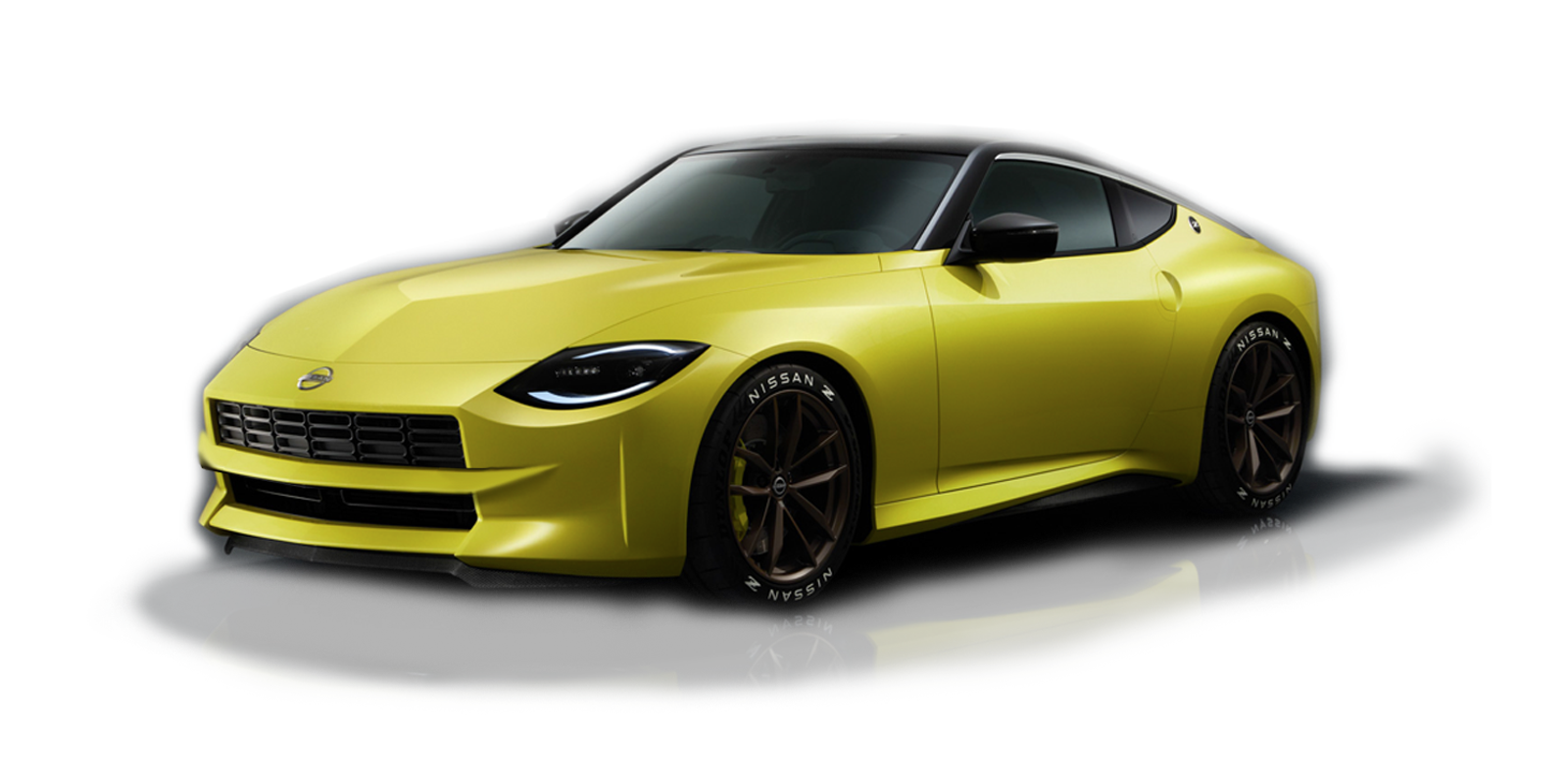
The new Z Proto (it’s still based on the current 350Z deep down) very clearly looks to the original car for inspiration, mostly from the original 240Z, but also taking elements from later developments of the Z cars.
It’s sort of a retro design, but in the sense that it has a set of design characteristics it pulls from earlier designs; it feels like a newly designed car that is pulling and adapting very specific forms and details.
Specifically, I think these are those key forms and details:

If we run down the list, we have:
1. A large, rectangular grille
2. That sort of Gothic arch-shaped hood bulge
3. That scalloped cutaway in front of the headlamp
4. The shape of the side windows
5. The round badge on the C-pillar triangle (and the whole shape of the pillar)
6. The near-unbroken roofline into rear deckline
7. That rear fender arch
Of these, so far the one I’ve noticed the most commentary on is that large rectangular grille. Personally, I kind of like it; the original had the same sort of grille, but it was bisected by a bumper blade, and sometimes just the upper section would be emphasized with chrome bars. You’d occasionally see the full unbroken grille on racing Z cars, though:

The big rectangular grille has always been there, it’s just that Datsun attempted to hide or divide it more, at least on the road cars. That approach—dividing the grille with a bumper blade—could still work on the new design if people had an issue with the unbroken grille:
Personally, I think Nissan should offer the dividing bumper blade as an option; then people who wanted to recall either the more refined look of the street cars or more the raw madness of the race cars could decide to put it on or not. Maybe it could even be easily removable and replaceable by the owner?
I’m looking at these and realizing I’m not entirely sold on the headlights, though. I think the appeal of the Z’s headlights has always been their deep-set quality and were at their best when covered with a plexi cover:

A modern take on this general shape, a more teardrop kind of design with more interior depth, I think may have worked better.
Design influences from later Z cars are present, too, as we can see here:

The mostly vertical door handle is a pretty clear reference to the most recent 350Z car, since that was one of its most notable design details, at least from the side, and the taillights, set into that full-width black panel and illuminating from behind like some sort of digital display clearly references the 300ZX taillight setup, also flush-mounted into a black panel and having similar shapes.
I don’t mind this sort of mix-and-match approach. I think the 300ZX taillights were interesting, and this adaptation of them feels extremely modern.
The black top on the Z Proto reminds me of the vinyl tops you’d occasionally see on Z cars back in the day:

Vinyl tops are such an irretrievably dated look now that I can’t imagine that’s what they were going for, but it’s what I thought of immediately. That said, I think it does work on the car, emphasizing the triangular sail of the C-pillar and helping to mask the thickness of modern window pillars.
Aside from its interpretation of design cues from Zs past, I think the biggest thing the new Z Proto gets right is more about what it doesn’t do. It’s a surprisingly clean and restrained design overall, relying more on the overall lines and forms and less on body contours and character lines and creases and vents and folds and flaps to convey its concept of sportiness.
This is, of course, in very dramatic contrast to one of the Z’s competitors, the new Toyota Supra. Here, look at the cars side by side:

Next to one another, it’s hard not to see the Supra as an absolute brawl of forms and shapes and panels and bulges and gaps and vents and mouths and gills and eyes and on and on. It’s almost monstrous if I’m honest.
Compared to the clean, smooth forms of the Z, I think the Supra feels like a biological, bloated mess. It’s too much, and it doesn’t have to be that way to convey power and speed and fun, and I think the Z is a great example of that.
I think Nissan did a good job here, and with just a few minor tweaks, this could be a fantastic car to remind people that Nissan is still around. I hope they can pull it off.


