
This may seem like a trivial thing—and, really, it is—but it’s something that’s bothered me for a while, and I really want to try and understand it. It’s something that I suspect some of you have noticed before, but likely gave it no thought. But did give it some thought. And the more thought I gave it, the more confused I became. It started with an amateurish picture of a Camaro on a video screen.
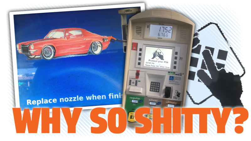
I’m pretty sure many, many of you have encountered this particular image, too. Here it is, in case you need your memory jogged:

Advertisement
If you’ve ever gotten gas at a BP, for example, you’ve likely seen this image, as BP is one of many major, national gas chains to use Gilbarco’s Encore series of fuel dispensers.

Advertisement
The Gilbarco Encore 700 S is one of these fuel pumps, and the kind I was using when I snapped this image. It’s a very modern, impressive, generally easy-to-use gas pump, the sort of thing you expect to find in a top-shelf 2019-era nation like our own beloved United States. These pumps are expensive pieces of equipment, costing many thousands of dollars each. This isn’t some toy; the Encore line of pumps are serious machines, designed for serious business.
That’s why this is all so baffling: why is that image so, you know, shitty?
Let’s be clear on just what I mean by shitty here; we’ve seen goofy gas pump displays before, perhaps the most notorious of which is this one:

Advertisement
We’ve all had a chuckle at that one, right? Because, we, as clever gearheads, could easily recognize that car as a Porsche 911, and we all know that on that famous car, the fuel filler is on the front fender, not where it’s shown there. In that picture, it looks like maybe they’re filling the rear side marker lamp with gas, which is not a great idea.
Still, despite the funny-to-car-dorks-error, this is not a bad image. If you take into account the considerable restrictions of that display—low resolution, completely monochrome, with just black/not black pixels—then you realize that some designer actually spent some time making an image that looked decent.
Advertisement
An original Game Boy can display more shades of gray than this screen can, so you have to cut that anonymous designer some slack. As far as that image itself goes, it’s not bad.
But this Encore Camaro image, it’s a different story.
First off, the Encore series of gas pumps does not have crappy monochrome, low-resolution screens. The LCD screen on the Encores I’ve used have been technically excellent.
Advertisement
According to the spec sheet, all the ones I’ve seen have had the upgraded option of a 10.4-inch VGA-quality display. The one I took that picture of had to be at least a 1024×768 resolution screen, and based on the lack of any dithering of the image, I think we can safely conclude this was a display with at least 24 bits per pixel, for a total of 16.8 million possible colors. Displays with specs that meet or exceed this are absolutely dirt common today.
What I’m saying is that there is no technical limitation or reason why the images shown on this gas pump have to suck. They can literally display pretty much anything they want. But these are the images they chose.
Advertisement
Let’s look again at that image that’s displayed while you’re pumping:

Advertisement
The choice of car itself is fine; it looks like a 1973 Chevrolet Camaro Z28, certainly a fun, distinctive-looking car:

Advertisement
…and it’s not even like the rendering of the car is particularly bad, as such, it’s just sort of amateurish. It looks like a hand-drawing that a talented but still young artist would do—like what a gifted teenager who loves cars would do with a set of markers in his or her sketchbook.
It’s not exactly a professional-quality image. And the way it’s been cut out and placed along with the fuel pump, with the pump going in the wrong place (I believe this era had the fuel filler behind the license plate, but that’s the least of the issues here) is even worse.
Advertisement
It looks like the sloppy work of someone who didn’t really know how to use Photoshop. There’s all kinds of newbie problems here, like the clumsy aliasing and white fringes on the car because it was cut out of a white background and placed on that flat blue background:

Advertisement
That’s some amateur hour shit right there. You see it also on the image of the gas pump, too. Plus, those are just details on the bigger issue that absolutely zero thought seems to have been given to the overall composition and layout of this image beyond just slapping a scanned drawing of a car and a gas pump on a default blue field.
Now, this would be fine on some high-schooler’s Power Point presentation, but this is on a machine that costs a lot of money and is sold by a major multinational vendor to another major multinational customer. There’s zero reason why this image has to be this half-ass.
Advertisement
And it’s not just this one image, either; the entire on-screen user interface of these gas pumps appear to have had zero effort put into their design. Just look at what the screen shows when it asks you for your debit card PIN:

Advertisement
What the hell is this? That clumsy image has half the resolution of what the screen is capable of: every pixel in that image is actually made up of a block of four, because this image was likely 25 percent the size it needed to be, so it was just clumsily scaled up.
The text is clunkier and blockier than the rest of the user interface as well, as you can see in this equally minimal-effort text-only screen:

Advertisement
Look at the difference in the quality of the text there; that’s text shown at the screen’s native resolution, and it’s much crisper and cleaner.
Does the PIN screen do its basic job? Sure, I suppose. But, as a former graphic designer and UX designer, it drives me crazy to see such sloppy, shoddy work.
Advertisement
It’s baffling because it makes no sense as to why this user interface is so shitty and careless. These are huge companies we’re talking about, and these are not budget machines. everywhere else on the machine care has been taken in the design—it’s even physically customized with BP’s colors and logo and graphics in this case.
Why doesn’t BP give a shit? Why doesn’t BP want their branding on the screen as well?
Advertisement
It’s not like other companies with similar machines get away with this in other industries. Let’s look at what is arguably the closest analogue to this sort of display user interface: bank ATM interfaces.
Without exception, every major bank’s ATM screen design is top-notch, impeccably professional looking.
Advertisement

I’m not saying you’re going to want to print these out and hang them on your wall, but they all at least look like somebody gave a damn.
Advertisement
They look like the bank understood that there was a certain level of polish and refinement that is to be expected of them as major corporations, and they took the efforts needed to design their visual interfaces accordingly.
Whoever was in charge of Gilbarco gas pumps’ UX design didn’t seem to be concerned with this. At all.
Advertisement
It’s not even like this would be that hard a job to do, really. It’s a just a few screens. Hell, I’ll make new screens for them over a weekend for a very reasonable fee. I bet there’s thousands of freelance graphic designers who could knock something out in a couple days that would put the current setup to shame.
I wanted to find out why this interface is so awful. What’s going on here? Is there a reason? Do none of their major gas station chain clients care at all? If so, why don’t they?
Advertisement
I reached out to Gilbarco, who is actually headquartered not far from me, in Greensboro, NC, to try and find out.
I called over and over again for almost two weeks now, getting bounced all around their phone system, leaving messages, talking to people to try and find out who was in charge of these things. No luck at all.
Advertisement
I checked out their online technical training docs, I explored the exciting videos at Gilbarco University, but got no closer to my answer.
Finally, I found someone who gave me a clue: Gilbarco’s software development and IT needs were handled by an Israeli company that Gilbarco bought, named Odysii.
Advertisement
For the past week I’ve been calling Tel Aviv to try and figure out who is responsible for gas pump UI design. Maybe there’s a good reason for these things—maybe that Camaro was drawn by the CEO’s talented kid, or something?
Well, I’m done waiting for my emails to be responded to, or my phone messages to be returned. So I’m going public here, in the hopes that someone at Gilbarco or Odysii will feel compelled to present their case, and defend their work.
Advertisement
So, I’m calling you out, Gilbarco/Odysii. Your interface on thousands and thousands of gas pumps that likely millions of people use every day is a fucking embarrassment. No other maker of major equipment with a screen-based, public-facing interface gets away with shit this bad.
Have you guys seen how modern soda machines work? Just watch:
That’s a fucking soda machine, dispensing flavored fizzy water, and it has a user interface light years better than your gas pumps, which dispense gallons and gallons of flammable liquids that most people need to live their lives. You should be embarrassed.
Advertisement
Ball’s in your court, fellas. Start talking.


