
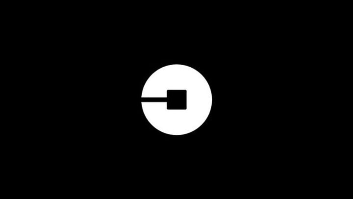
That’s Uber’s new logo which isn’t a stylized “u” anymore. Which is a weird choice that doesn’t seem at all connected with the name of the brand. Updated with more information and another logo.
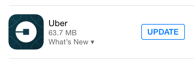
The new logo, along with quadcopter-like background, is already everywhere from App Store:
Advertisement
To the official Uber twitter account:
The old “U” one is still trademarked by Uber, but I bet we’ll be seeing a filing on the new one relatively soon.
Sponsored
There’s no real reason for the change we can tell, other than maybe that Uber is trying to make itself over as a company. In which case, a weird disc with a square isn’t going to cut it.
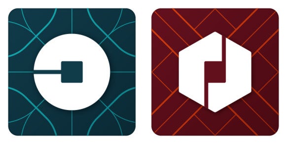
Updated: Wired has a piece on the new (and colorful) redesign. The logo we’re seeing everywhere is the “rider” one, with another “partner” one:
The new logo, as one of the other writer’s here has pointed out, bears a bit of a resemblance to the logo for Chase.
According to Wired, founder and CEO Travis Kalanick didn’t go to a marketing company for the rebranding (also called a “coming of age” story in Wired), but did it all in-house.
Maybe if they had gone to someone else, they would have been told that a logo so totally divorced from a connection with the actual name of the company defeats the purpose of a trademark: easy identification.
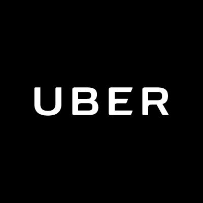
The new wordmark—the font and spacing of the company name—is actually great. It is much easier to read and still keeps some of the classic Uber look:
The rest of the Wired story will fill you in on how Uber chose the new colors, picked the tessellated pattern after being inspired by bathroom tile, created mood boards, based the look on a blog post by Kalanick, and how they reworked the process once they figured out the problem was they were designing a logo for Kalanick and not the users.
For my part, I’m going to go back to wondering why the line in the “rider” logo isn’t at least vertical, which would make it look slightly more like a “u.”
Contact the author at katharine@io9.com.


