This chart might tell the whole story.
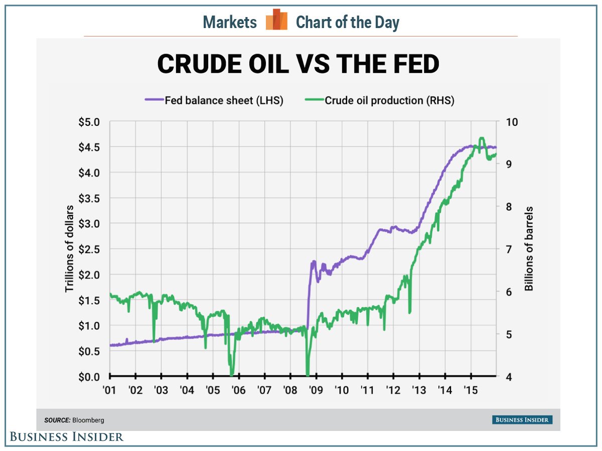
On his latest webcast on Tuesday, Jeff Gundlach, CEO and CIO at DoubleLine Funds, presented the following chart showing the uptick in the Federal Reserve’s balance sheet and the increase in US oil production.
The idea here is that oil and gas production and exploration was — for many US shale producers — at heart a speculative investment.
But with interest rates low and investors starved for returns, money poured into shale oil production. And this was made all the more attractive with oil prices sitting near $100 a barrel for several years following the financial crisis as things like “peak oil” became received wisdom.
Now, of course, things have changed.
Oil is near $30 a barrel, an 11- or 12-year low depending on whether you cite the West Texas Intermediate or Brent benchmark price. US and international production also remains near record highs.
Crude oil inventories are also near multi-decade highs and the US oil rig count has collapsed.
Production, however, continues near record levels, and the Fed’s balance sheet is heavy, since it created over $3 trillion in cash to help the economy recover from the financial crisis.
It’s no surprise that oil and gas producers took advantage of all this cheap money. Business Insider, data via Bloomberg


