
The U.S. Federal Highway Administration is killing the current decade-long test of looking into replacing highway signs with a new “Clearview” font it designed and developed to be more legible because, twelve years later, it turns out the new font actually made sign legibility worse.
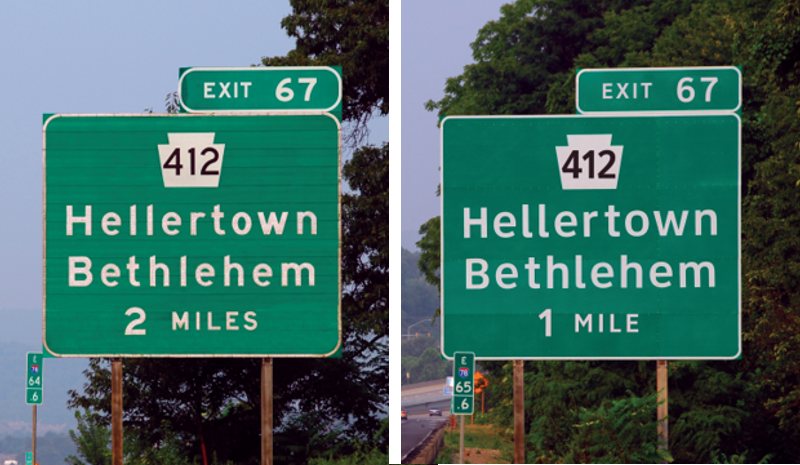
Back in 2004, the Federal Highway Administration approved state use of a new font ironically called “Clearview” to be the new face of highway signs around the nation. At the time, testing had “proven” that the new font was more legible to drivers, specifically at night, than the old signs featuring the “Highway Gothic” typeface.
Advertisement
It turns after twelve years of integrating the new font onto select highway road signs around the country, “Clearview” has been proven to not be any more legible than the old highway sign font. Not only that, but the new font is actually worse for legibility on signs with negative-contrast color schemes. That signs with dark letters on light backgrounds—you know, like SPEED LIMITS.
How could this test go twelve years before being nixed? While initial tests back in the early 2000’s did prove that the new signs with the new font were more legible to drivers, years later it is now being realized that this was due to the new signs simply being, well, new. The clarity of the colors and lack of weathering and age proved to be (rather obviously) easier to read than older, aged signs using the “Highway Gothic” font. The font, in this case, had nothing to do with legibility.
Sponsored
The FHWA wont do anything to reverse the thousands of signs that have been replaced or installed on roadways over the last decade, but will stop using “Clearview” on new signs going forward. The highway system will now revert back to “Highway Gothic” which new tests confirm is, in fact, the more legible font in all situations.
You can read the release from the Federal Highway Administration here.
This article was originally unclear that the new font was an extended test, and not a national roll-out—though many states have adopted the font for many roadways.
Contact the author at justin@jalopnik.com or @WestbrookTweets.


