
It’s difficult to conceptualize excessively large numbers, particularly when they pertain to human tragedies. But this highly-engaging animated data visualization by Neil Halloran makes WWII-related deaths all too comprehensible.
The 15-minute video (it’s well worth the time to watch), titled “The Fallen of World War II,” is divided into three sections. The first is an analysis of soldier fatalities by nation, while the second tackles civilian deaths (including the Holocaust). The final section provides a fascinating and illuminating overarching perspective of WWII in the context of previous conflicts and those that followed.
Advertisement
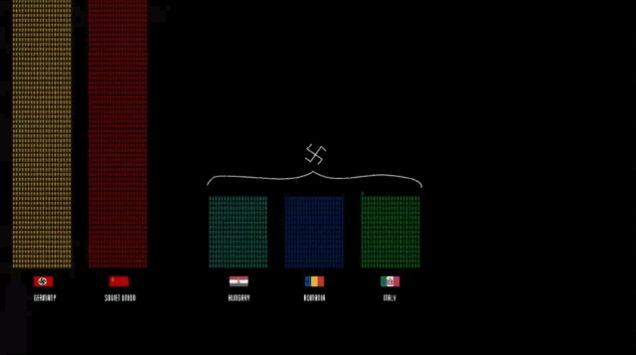
Among the more jaw-dropping moments in the video — of which there are many — are the charts showing total Soviet losses during the war (~ 6 minutes into the video). Many of those loses can be attributed to the professional state of the Wehrmacht and its superior application of tank warfare. But these staggering loses can also be attributed to Josef Stalin, who purged many of his top generals before the war and who had no qualms about throwing a seemingly endless supply of men into the Nazi meat-grinder.
The visualizations showing civilian losses is equally terrifying, especially as it pertains to Poland whose civilians (arguably) suffered the most during the 6-year conflict.
Sponsored
For an alternative, enhanced, version of the video click here.
H/t Open Culture!
Email the author at george@io9.com


